


Case study · Concept
Rethinking filters in the Tamara app.
I was searching for a tablet deal on Tamara when I got confused by the filters, and I wanted to make it easier.
Later in this design exercise, I explored what happens when payment plans and monthly budgets are brought up front. I feel these make Tamara special, but they show up late in the purchase journey instead of helping the decision early on.
It started with a search for a budget tablet.
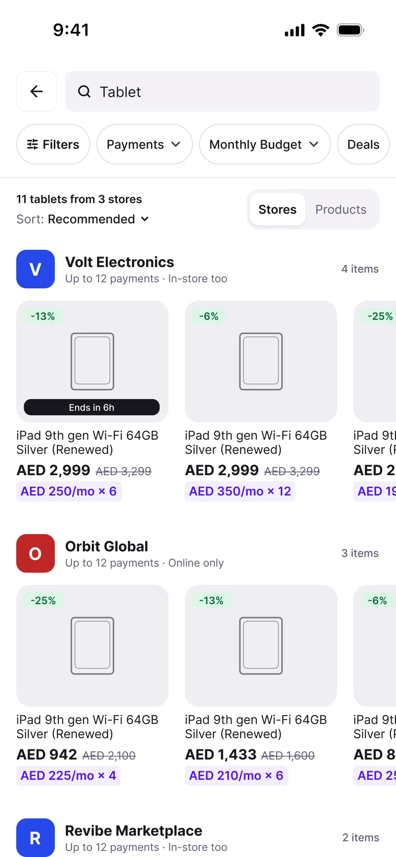
I was searching for tablets in the Tamara app. When I tapped more filters, they folded into one pill that said "3 applied". I was confused at first, then curious. Tamara is all about paying monthly, yet I had to dig to find payment plans and monthly budgets. So I wanted to see what a proper filter sheet could look like: one that gives you more control over all those deals and helps you decide faster.
What I noticed.
Three things that stood out.
The chips move as you tap.
I tapped a filter and it folded into a "3 applied" pill. The thing I pressed wasn't where I pressed it anymore.
I couldn't tell what a filter would do.
I only found out after I tapped. If it gave me nothing, I had to undo it and guess again.
Payments and monthly amounts were a little hard to find.
They're what make Tamara different, so I wondered if they could sit closer to the front.
My idea: two simple rules.
See the result before you tap.
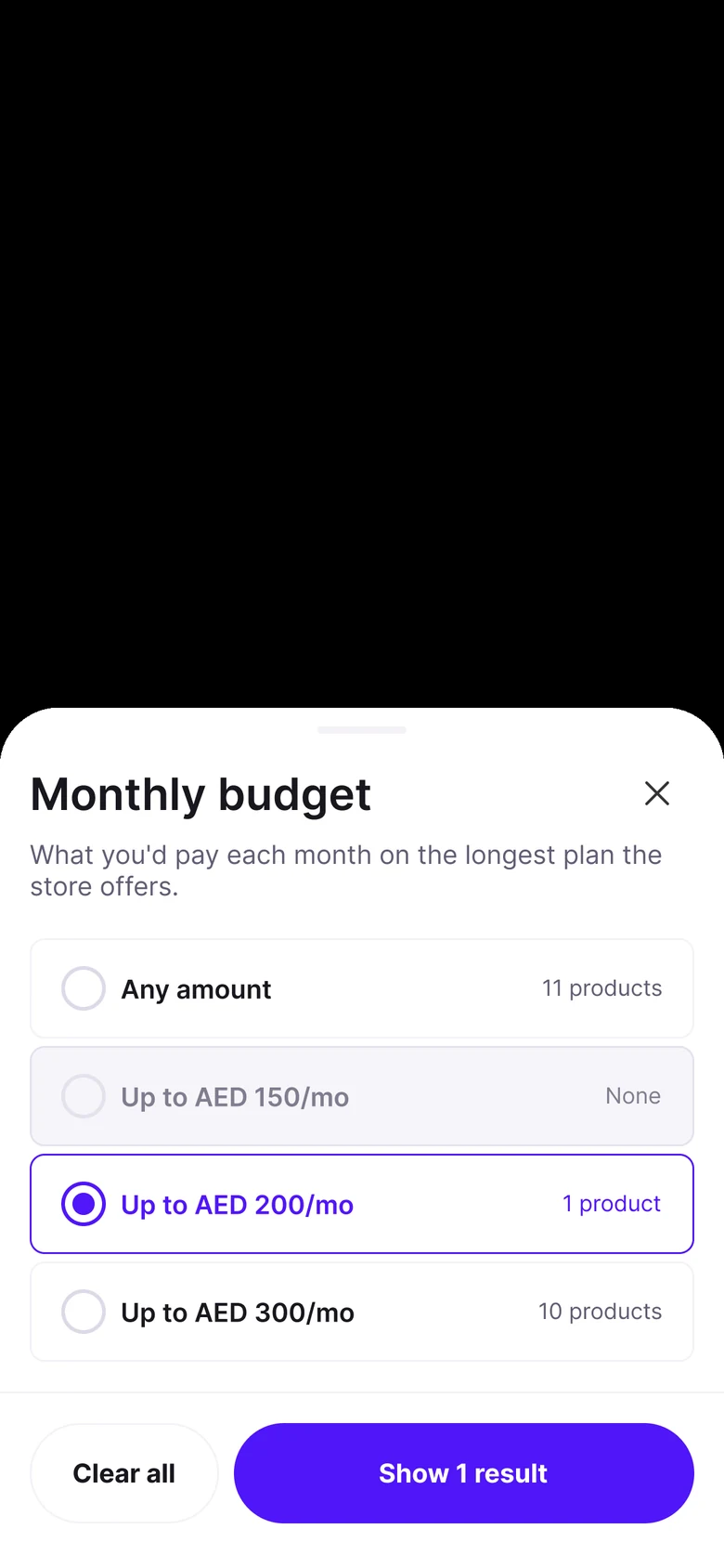
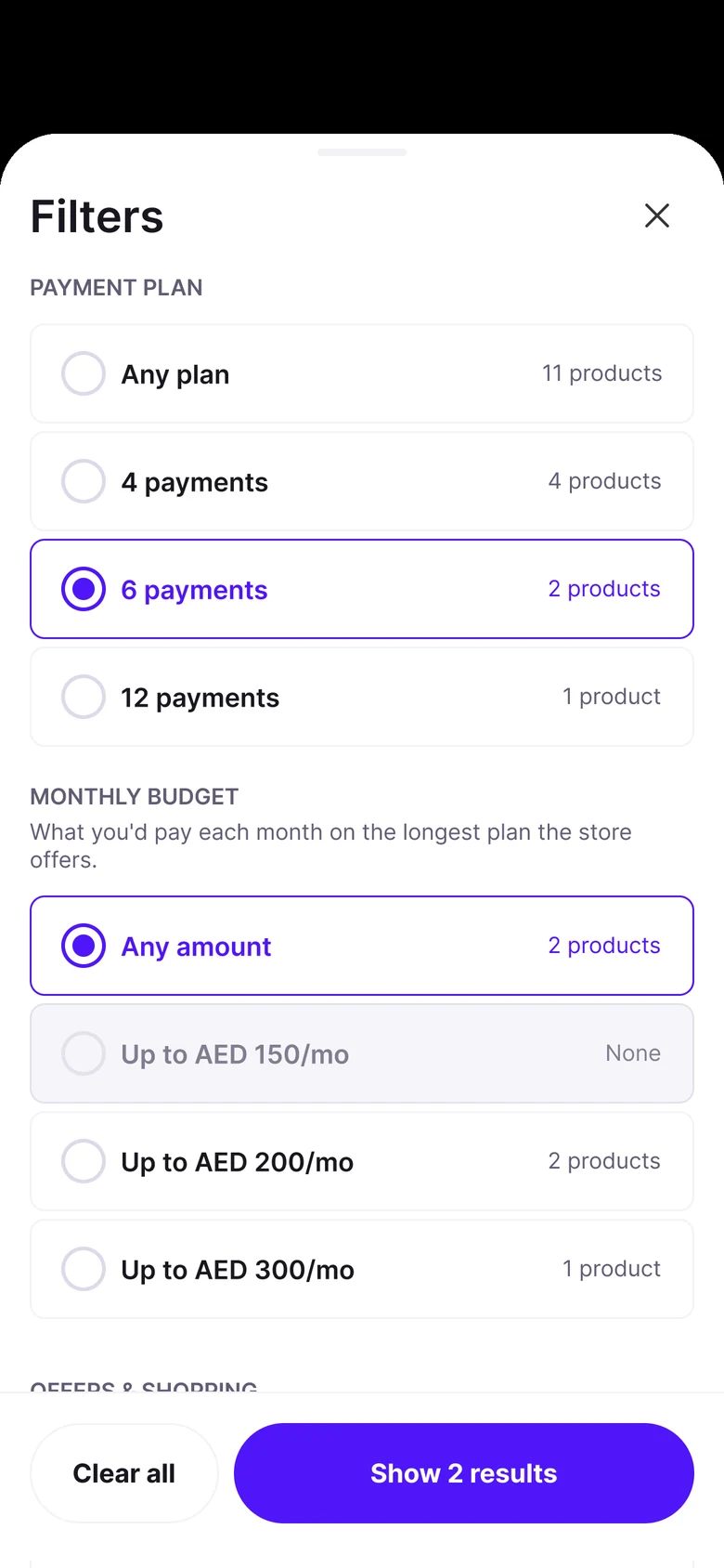
Every option shows how many products you'd get. If it would be zero, it's greyed out, so you never hit a dead end.
Filters stay where you tapped them.
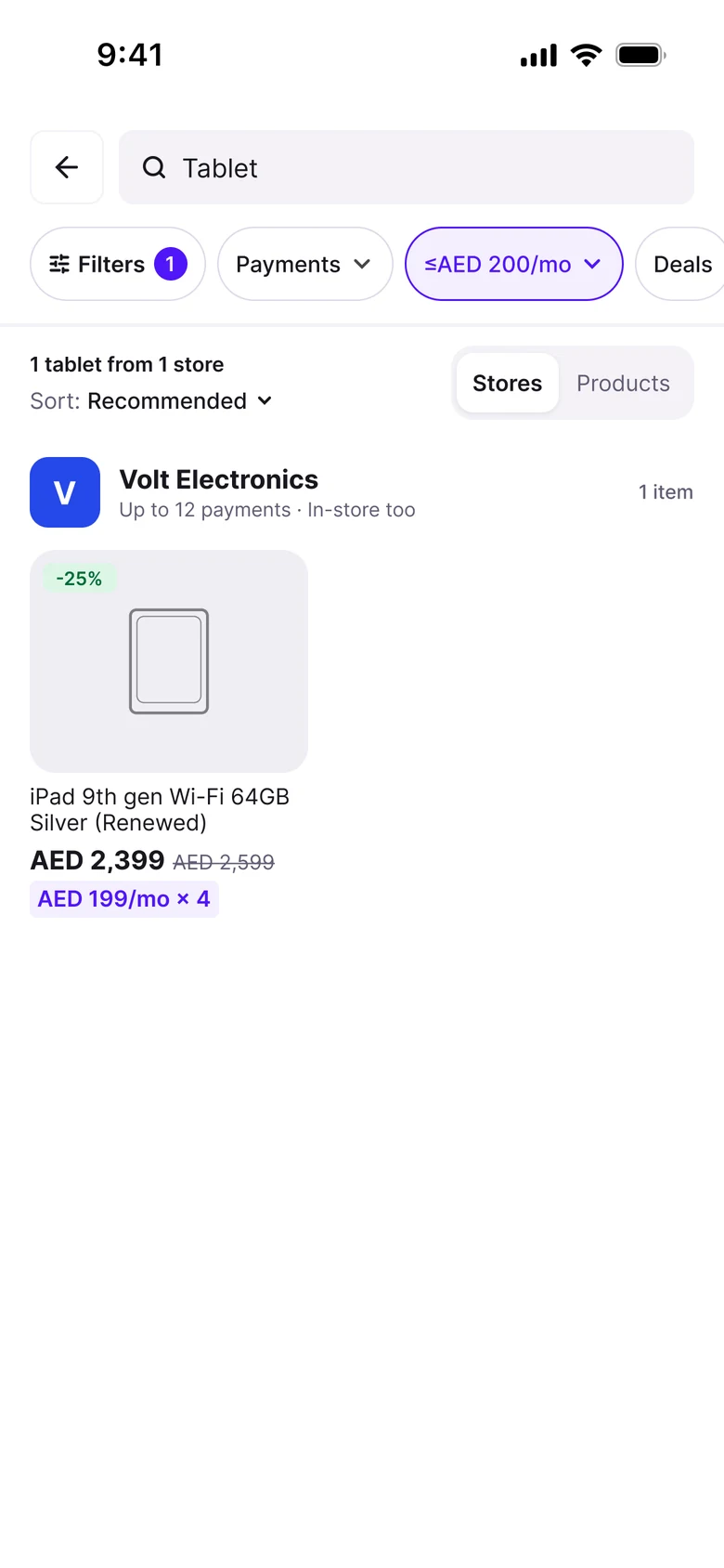
Chips never move, fold or reorder. A chip you pick just turns purple, and a small number on the Filters button tells you how many are on.
Before and after.
Same search, same tablets. First what I saw, then what I'd try.
Before
Tap more filters and they fold into one pill. The rest of the row shifts, and the list reloads.
After
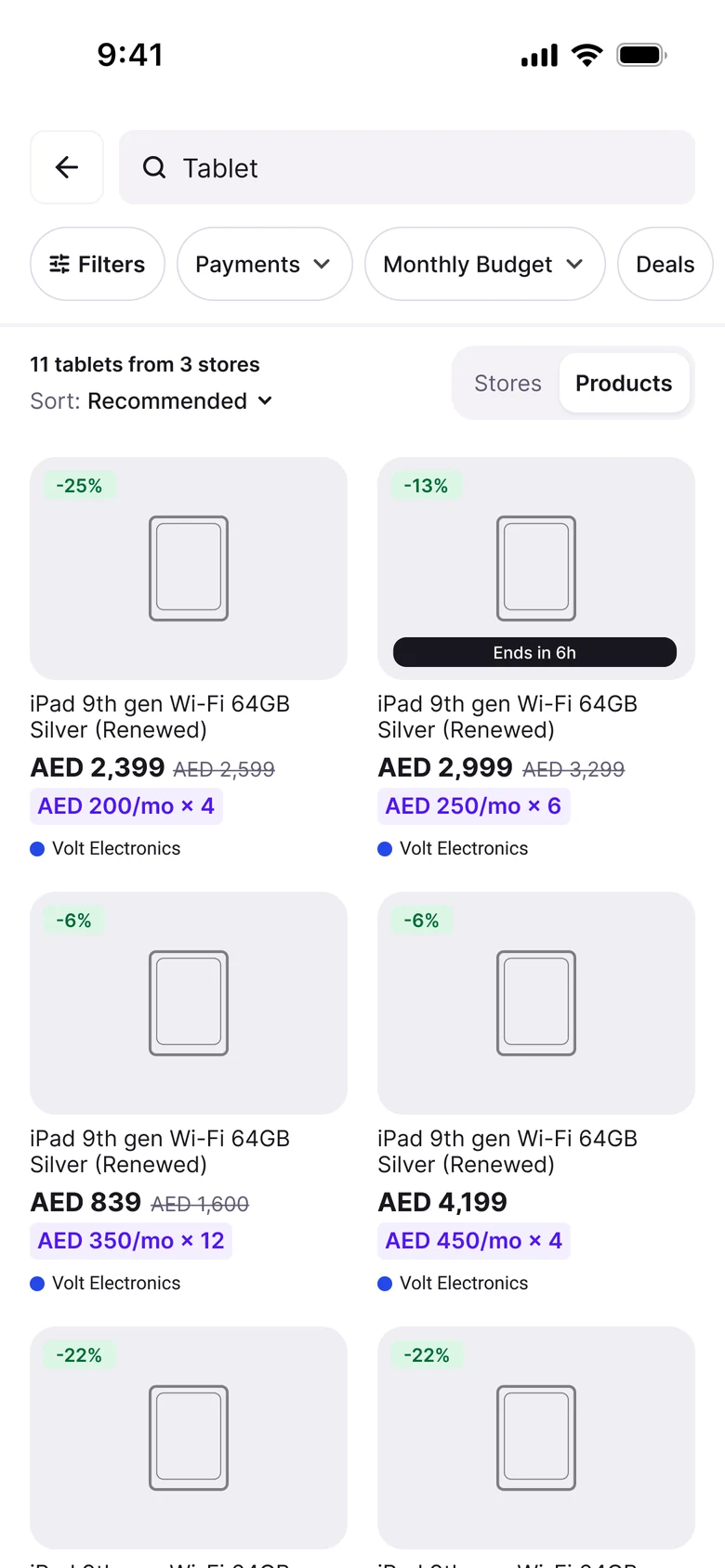
Chips stay in place. Sort and the Stores / Products switch get their own row.
Paying monthly is one of Tamara's core features.
My assumption is that people don't shop for a tablet on Tamara only by price. They shop by the question "What can I pay each month?" So I tried to find ways to answer the question they're already asking.
Monthly budget gets its own chip and its own sheet. Pick "Up to AED 200 / month"* and you only see what fits. Payment plan works the same way, so the two things that make Tamara different are one tap away.
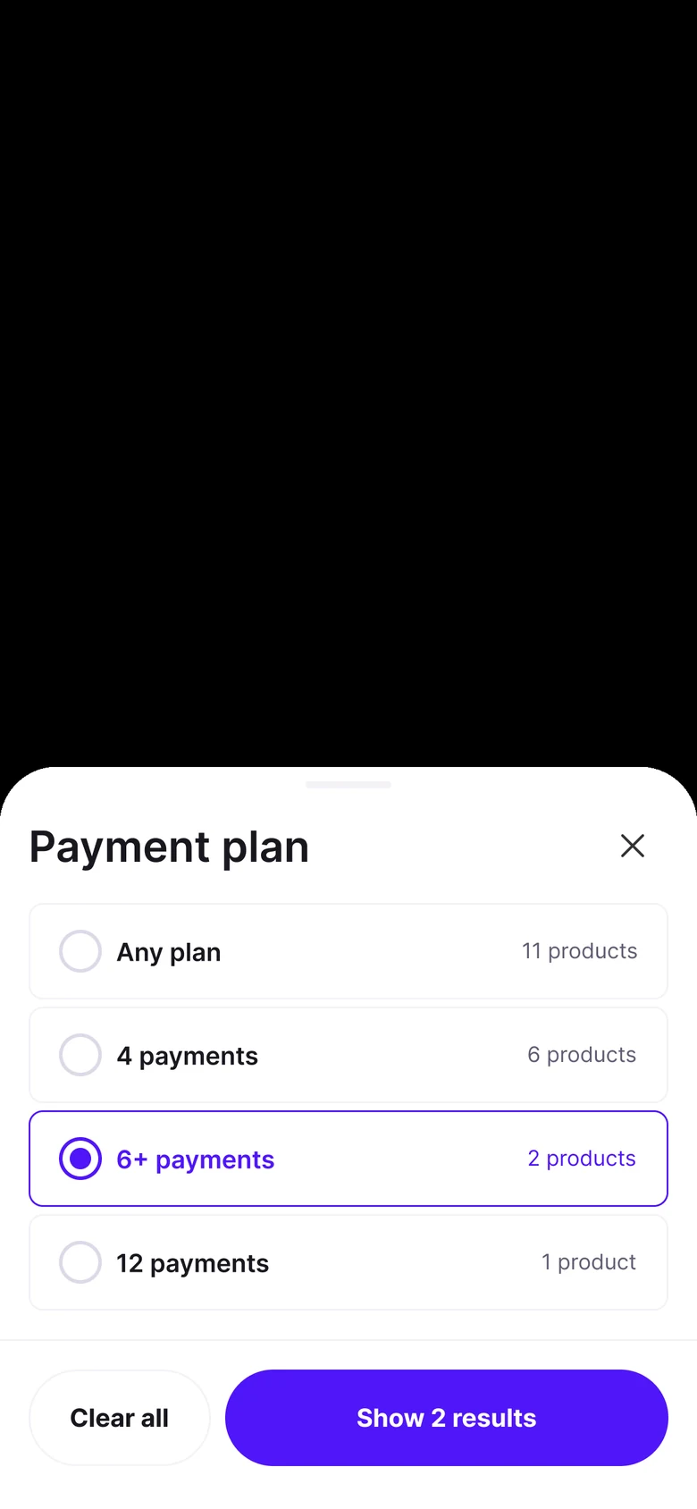
* I first wrote "Under AED 200". But a tablet at AED 199.90 a month shows as "AED 200/mo" on the card, so it looked like the filter was wrong. "Up to" fixes that.
A few polishes.
No dead ends.
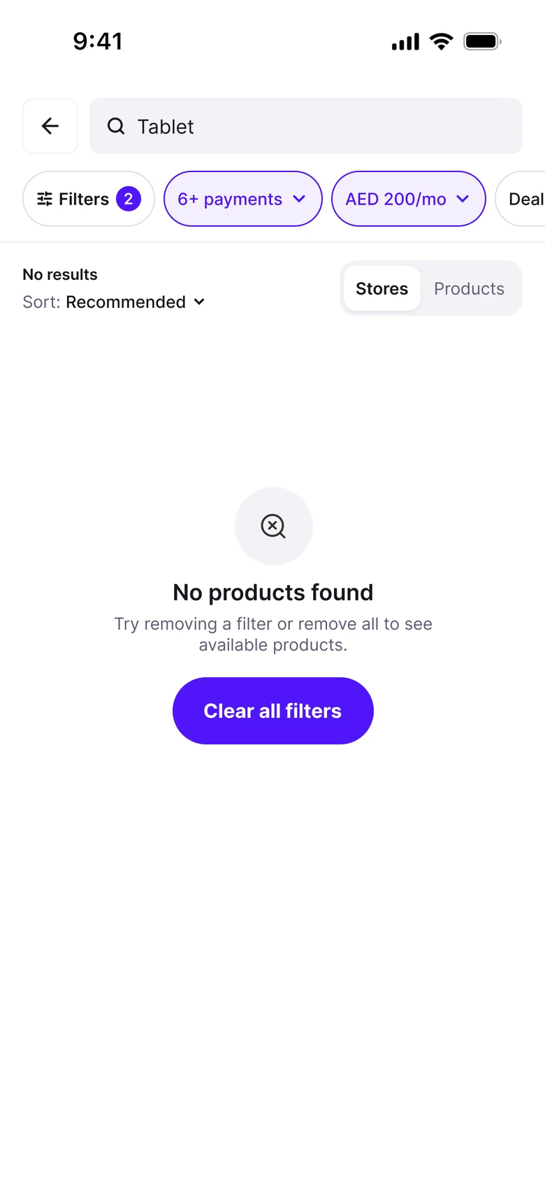
If nothing matches, the screen says so and gives you a way out.
Sort that fits.
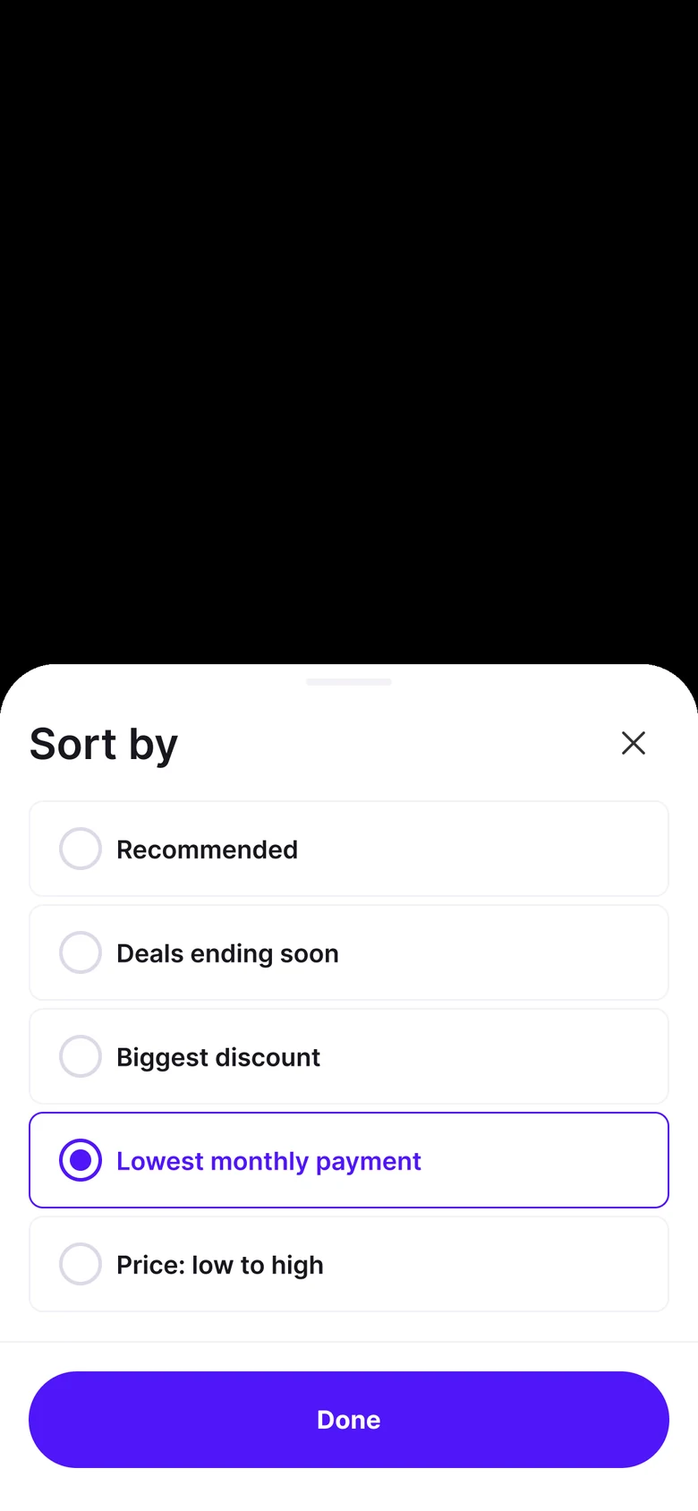
The sheet shows the full names. The screen shows a short one, so the row doesn't break.
One or many, you can tell.
Pick-one lists, like payment plan, use radio buttons. Pick-many lists, like brand, use checkboxes. Brand also has its own Clear all, so you can start over on brands without wiping every other filter.

All the filters, in one place.
For people who like to see everything at once. Every option still shows its count. Go ahead, scroll inside the sheet.
Payment plan
Monthly budget
What you'd pay each month on the longest plan the store offers.
Offers & shopping
Brand
What if paying monthly was the first thing customers saw?
I enjoy this kind of problem: small details that change how fast someone can decide, in a product people use every day.
I'd also love to hear what's behind the way filters work today, because I'm sure there's a lot I can't see from the outside.
A few questions I'm still wondering about, late at night
- Why do the filters fold into one pill, and what did people do with it?
- How much do people shop by the monthly amount?
- What would worry you about trying something like this?